Back in October 2015, I had the immense privilege of traveling to Venice to make art for The New Venice Haggadah. In 2016, Venice, Italy, was to mark the 500th anniversary of the formation of the Jewish Ghetto in Venice, the first ghetto in Europe, founded during Passover in 1516. To celebrate 500 years of Jewish life in Venice, Beit Venezia (formerly the The Venice Center for International Jewish Studies) initiated a year-long series of events, including plays, symposia, and other cultural programs. In the 16th and 17th centuries, Venice was a primary center of Jewish book production. It was there that the first complete Talmud was printed, the first Mikraot Gedolot (a bible with a number of commentaries printed on the same page as the biblical text), and a highly-regarded multi-lingual illustrated Passover haggadah from 1609. In recognition of this history, Beit Venezia invited eight artists from around he world to create new work for a New Venice Haggadah, honoring the city and its distinctive community.
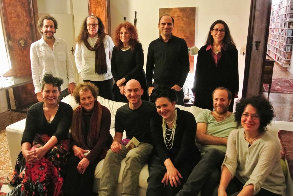
Partnering with the Scuola Internazionale di Grafica Venezia, and based out of their print studio, the eight of us spent three full weeks living in Venice, learning about the city’s history and its distinctive Jewish community from scholars, artists, and locals. Each artist then created two full-page copper-plate etchings on specific passages in the haggadah as well as smaller filler illustrations. The finished art was displayed at the Venice Jewish Museum and later at the Doge’s Palace. The project was featured on Italian television station Rai Une and by JTA, among other media outlets. The New Venice Haggadah was originally slated to be published in 2017 or 2018 but faced unforeseen delays. I am overjoyed to announce that the haggadah is now available for Passover 2021, and can be purchased from publisher Damocle here.
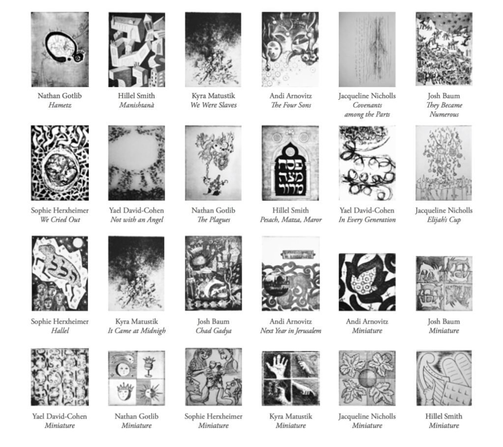
I was tasked with the plates for Ma Nishtana (the four questions) and Raban Gamliel’s stressing of “Pesach Matzah Maror” as the most important part of the seder. Here is an in-depth look at my pieces and the inspiration and process behind them.
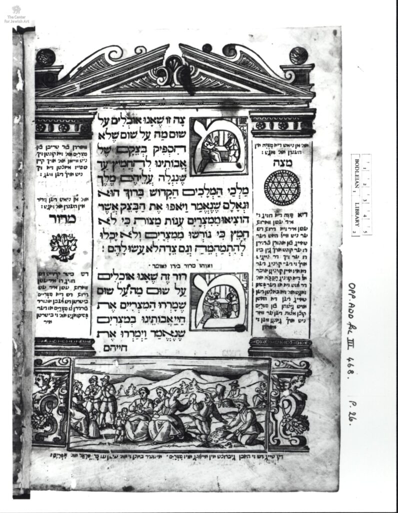
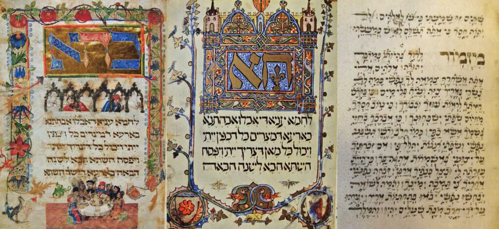
The 1609 Venice Haggadah included remarkable woodcut illustrations that were copied for many later editions, and was printed in simultaneous editions featuring translations of the Hebrew in Judeo-Italian, Judeo-Spanish (Ladino), and Judeo-German (Yiddish), languages spoken by Jews then living in Venice. In creating my illustrations, I wanted to reflect on the history of the unique Venetian Jewish community, on the 1609 haggadah, and the larger history of Jewish book culture.
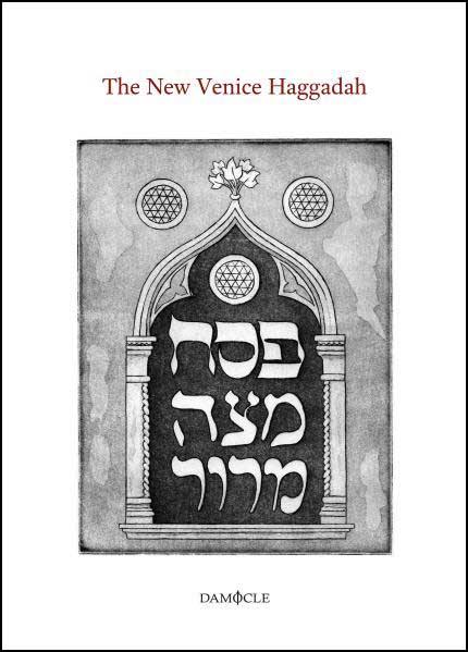
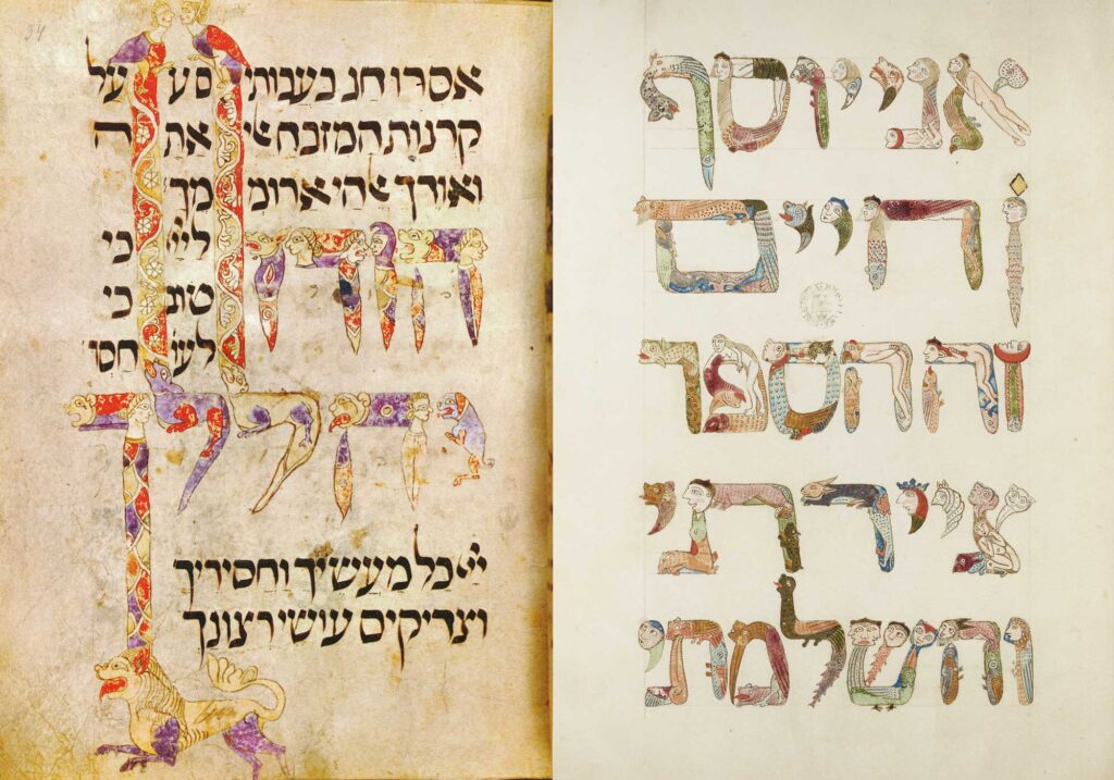
Medieval Jewish illuminated manuscripts frequently featured text framed by architectural elements in the style of the region and era. These structures link these books to the time and place of their creation. Many of these books include other elements, like coats of arms, that demonstrate the creators’ feeling of belonging to their country of origin. Thus, when creating my plates, using local Venetian architecture was central to my planning.

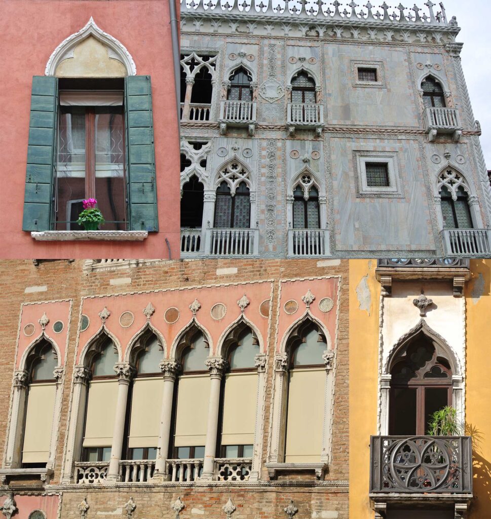
Walking around Venice, I was taken by the distinctive windows with their peaked ogee arches and trefoil cutouts. While the original Venice Haggadah itself did use a kind of Italian Renaissance-era pediment as a page frame, these windows struck me as more specific to and evocative of the Venice I had encountered.
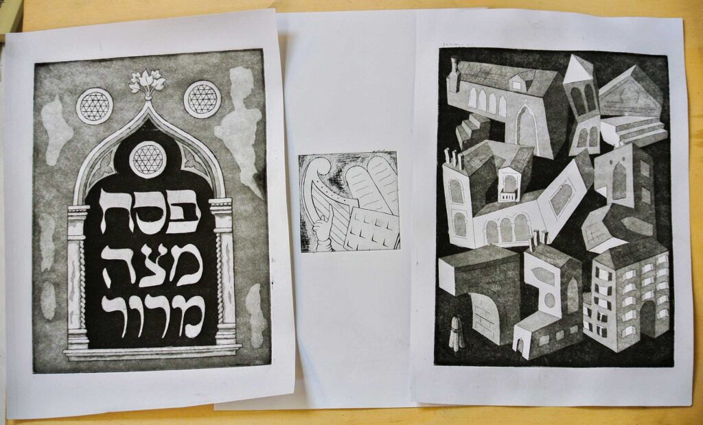
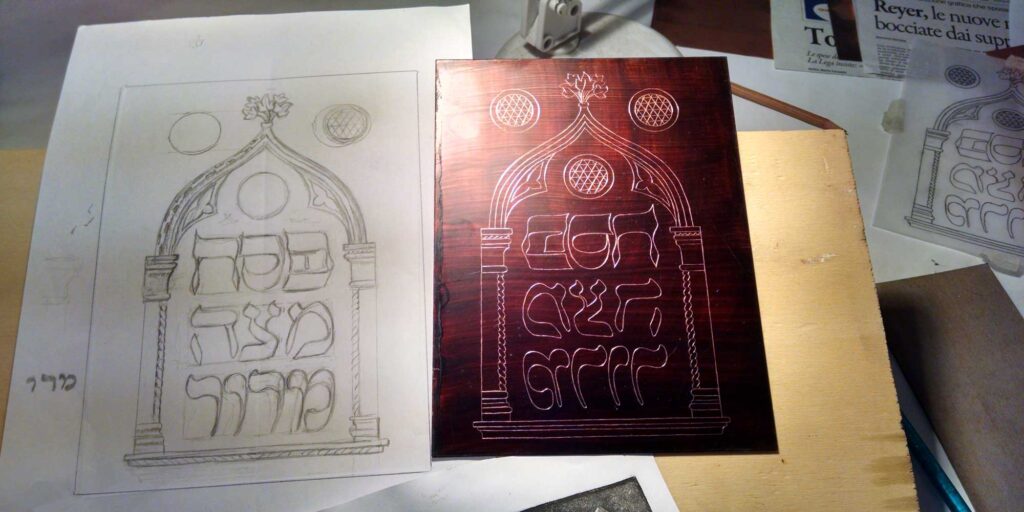
To connect my illustration of Pesach-Matzah-Maror to the 1609 haggadah, I pulled its depiction of the matzah and the maror and integrated three of its matzot for the roundels and its maror for the fleur at the apex of the window. (The Pascal lamb, however, is missing, just like it is missing from our seder until the coming of the Messiah.)
Raban Gamliel taught that one who has not discussed the triumvirate of Pesach, Matzah, and Marror has not fulfilled their obligation at the seder. As the seder would be incomplete without these three items, so too would the history of Jewish Venice be incomplete without recognition of the three traditions that comprised the Venetian community—Ashkenazi, Sephardi, and Italian. Each of those communities had distinctive calligraphic Hebrew scripts, and I chose to write each Hebrew word in a different traditional script: Pesach in Ashkenazi script, Matzah in Sephardi script, and Maror in Italian script. (Note that while the Ashkenazi and Sephardi scripts I used are “book hands” used for formal calligraphy, the Italian script is based on a semi-cursive script, used for running text, as there wasn’t a true distinct Italian book hand.)
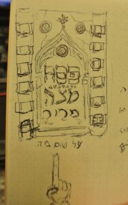
I took all of this inspiration and began to sketch. An early small thumbnail included windows of a “Venetian high-rise” along the sides (see below) and entertained the idea of including a manicule (a pointing finger, common in old manuscripts, and also recalling the custom of pointing at the three foods at this point in the seder) but ultimately settled on staying focused on the main window and the words.
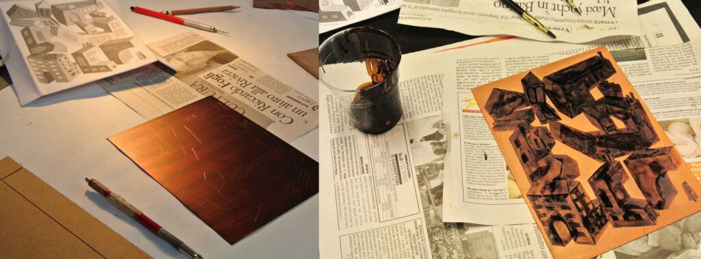
Then I drew the design larger at actual size, refining the details and the lettering. I transferred the design to tracing paper, then traced it in reverse on a waxed copper plate so I could etch the lines with an acid bath. The layers of tone were achieved with a process called aquatint, successively masking areas of the drawing with wax and bathing the plate repeatedly in weak acid.
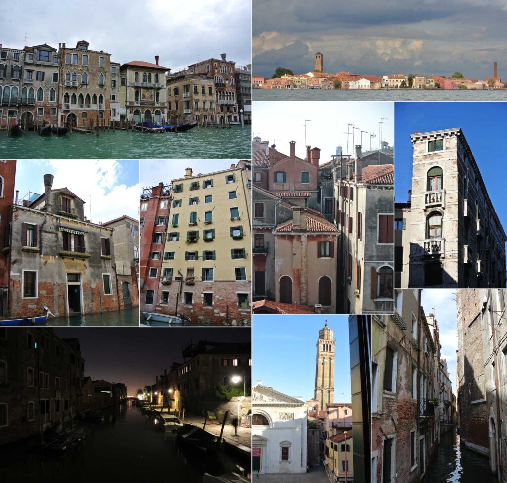
For my second plate, I utilized Venetian architecture in a different way. The Ma Nishtana asks how this Passover night is different from all other nights. I asked myself that question about Venice—what makes that city unique among all others? Exploring Venice by foot and boat, I was enraptured by its characteristic architecture: the stately grandeur of the palazzos, the elegant bridges, the monumental churches, the labyrinthine streets, and, of course, the waterways that give the city life. And as the ancient city sinks, its walls and towers fall into ever more jaunty angles. I took so many photos of the city to try to capture my experience there and the places I saw, from the leaning tower in the square opposite our apartments, to the “Venetian high rises” of the ghetto. (Jews in the ghetto were not allowed to build up, so they often split the floors in half, yielding multi-story tenement buildings that are still quite short.)
Ma Nishtana is traditionally sung by the youngest child (fittingly, I was one of the two youngest artists in the group) and epitomizes the sense of wonder animating the seder. Here I was also inspired by historical illuminated manuscripts, in this case by the typographic play of certain books like the Hamilton Siddur and Kennicott Bible colophon.
I wanted to capture the whimsy of this fantastical place, and connect the wonderment of the seder to the wonder of Venice. I spelled out the Hebrew words “Ma Nishtana” with imagined impossible buildings based on the real, incredible Venice, its hidden courtyards, its letters “crowned” by chimneys. Tucked into a corner (as the Hebrew letter tav) is a “Venetian high rise,” making sure the Jewish presence is recognized. The drawing style is simple, evoking a child’s drawings or building toys. I designed the lettering digitally, printed it out (in reverse, on the aging printer at the only internet cafe in our part of the city because there wasn’t a usable printer at the Scuola), and traced it onto a prepared copper plate. Again, I used aquatint to create the tones in the etching.
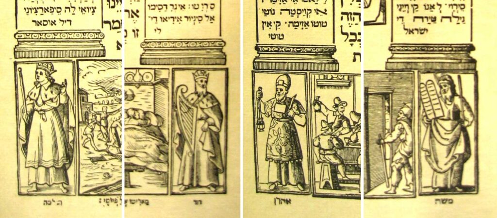
Finally, each artist also made a miniature plate, to be split into four small spacers and used as needed within the haggadah. I again took inspiration from the 1609 edition, which featured Moses, Aaron, David and Solomon as space fillers in the bottom corners of the pages. I took a signifying item from each—Moses’ tablets, Aaron’s breastplate, David’s harp, and Solomon’s finger—and combined them in a unified graphic of leadership that can be displayed as a block or as individual elements.
This was a very meaningful project to work on, and indulged my interests in history, books, typography, and place-making. Here’s to 500 more years!
Oh, how wonderful and glorious to read about this entire project. What talented
people you all are! This is another one “For the ages to come.”